Friday, February 26, 2021

Making up content of the magazine

    Today I'll be primarily be focusing on what specific topic I want to talk about, by specific topic I meant other stories that will fill up my cover and my table of contents. Referencing back to the calendar I have a double spread content decision day saved for March 3. :)

Referring back to my survey, my audience prefer to see a variety of things to do in Wynwood rather than just focusing on one specific topic of the district, in which I agree 100%. They also wanted the safest route and areas in the district so that they returned safely to their home.

Due to their preferences I compile a list of things that could be potential candidates for other stories

  • Food
  • How to stay safe on the Miami roads (1-95 is just pure chaos!)
  • Other fun activities in Wynwood
  • Shopping for merchandise
Now for these topics I need some catchy and attention getter headers and then giving a brief explanation. Since this is quite content easy, I have decided to put it in a PowerPoint.
Here is some Food titles that I came up with when talking about food. As of right now, I'm very fond of the Good Day, Good Food one. I like it because it creates a bit of suspense to readers as to what type of food I'm talking about, which will lead them into reading the articles. Although the others do create a sense of suspense, I felt as though they aren't that original regards to an article, since I see these type of titles in other magazines.
Out of the three I thought of, I prefer Avoiding the Havoc! because to my audience it sounds like a dream to avoid traffic when traveling anywhere. I also found the other two a bit flat line and just meh, like it's just there, it doesn't show any spice.

For other fun activities I couldn't really think of anything and I decided on More than just Murals, because it could be anything and keep it interesting. I thought of Dunking in the 305, because I found there was a unique basketball court in the district that had vice city vibes and wanted to talk about that. If I did chose this I feel it doesn't create that suspense with my other titles.
Lastly, for shopping I pick Treat Yourself! because it sound exciting and have a sense of a hyper aura. The other two I didn't feel a certain spark with the other two titles and it just sounds boring.


Tuesday, February 23, 2021

Timeline

 Today I decided to layout my month of March since the due date for everything is coming up soon and it'll help me stay organized while I finish my final product :)


I feel more comfortable and at ease that I have a schedule to go by and I'll be following this timeline and probably add one more blog or two if I have anything to report!


Saturday, February 20, 2021

Preliminary Sketch (Double-Spread)

 Hello! So I have decided today that I'll be focusing on my sketch of the double spread for my magazine. I came up with two different sketches.

This is one of the first sketch that I came up with. I was planning to have a main image of one of the more popular murals which was the same as the cover. I feel this spread doesn't work because the caption for the others is taking up space for the other images, which makes it kind of unorganized. The one exception from this rule is the main image since it is bigger and the caption covers a small portion. Since I didn't like this I decided to put it outside the image.

By putting it outside, I like this a lot better. It looks organized and the audience is able to get a full view of the other pictures without a caption disrupting it. I'll go with this layout for now. :)


Wednesday, February 17, 2021

Preliminary Sketch (TOC)

 Today, I decided to sketch out my layout for my table of contents page. I took majority of my inspirations from the magazine that I've picked to analyze. I'll be explaining and showing my process of thinking when considered my table of contents

First I made a sketch of a TOC with an image as the background for the spread. I was planning to put a different art mural that I found at Wynwood. The text was going to interchange between black and white text to allow for the text stand out from the image. Sunshine and contents at the top are going to have the same font as the masthead from the cover spread. I was starting to have an appeal to this design and then I decided to rearrange the contents.
As shown, is the content being rearranged. I wasn't really feeling it with it like this and I ponder some more and decided to scratch out this idea. To me, I have to prioritize my audiences preferences more rather than mine and they did prefer to see a variety of items on a page. With one image, I feel as though I wouldn't truly capture Wynwood well.
I decided to make another one that was inspired by another TOC I used for my analysis. I feel as though I like this design better, because you are able to see more by the images rather than looking one massive photo. The hashtags within the image boxes are going to correlate with the content provided to allow readers to connect the images and information about it, and in turn will want them to read more.


Friday, February 12, 2021

Preliminary Sketch

 Today I took the time to come up with a Preliminary Sketch of my cover for the magazine. I have put it set and stone for my cover to featured Maya's artwork in Wynwood Walls, because of its bright color plus its popularity amongst teens. With that, I decided laying out the cover.

Firstly, in Photoshop, I came up with this plain cover with no one in the background. Although I like the simplicity, I feel as though adding someone in the picture will be able to aid in readers to capture an idea of themselves there in the photo. I also find it as though it will be proven difficult to lay out my cover lines with no guide from a model nor the background itself. With this in mind, I decided I have to scout a model. I turned towards my friend Olivia. She have a funky and vibrant style to her outfits that I thought she'll be a prefect model. I received a headshot from her, but there was a filter on her image, so it really gave a good view, but I have to work with what I got!


Here is a sample with no boxes which the boxes symbolize the cover lines. The next image have them.

With Olivia on the cover, I'm able to organize the cover a little and fill it up more so that the article will be more eye catching to an audience. So once I get an official photo of Olivia and the wall, this is the layout I'm sticking with!


Wednesday, February 10, 2021

Researching on Wynwood

Since I'm unable to visit Wynwood during this week, I decided to do an initial research of the area before I visit and report my findings and take some pictures for the magazine. This initial research will include the background of the area, hot spots such as restaurants and art pieces.


Background of Wynwood

Wynwood is a district in Miami, Florida. According to wynwoodmiami.com, it is home to art galleries, retail stores, antique shops, eclectic bars, artisanal eateries and one of the largest open-air street-art installations in the world. During the 1900s Wynwood was home to Caribbean immigrants until the Great Depression hit. Because of the Great Depression, the people neglected warehouses, shuttered factories and unused buildings and turning them into innovative businesses. The street art influenced the art of Wynwood. Art in Wynwood was introduced from the events such as introduction of the Second Saturday Art Walk and the annual Art Basel being held in the area. 

What is Art Basel Guide Biggest Art Fair

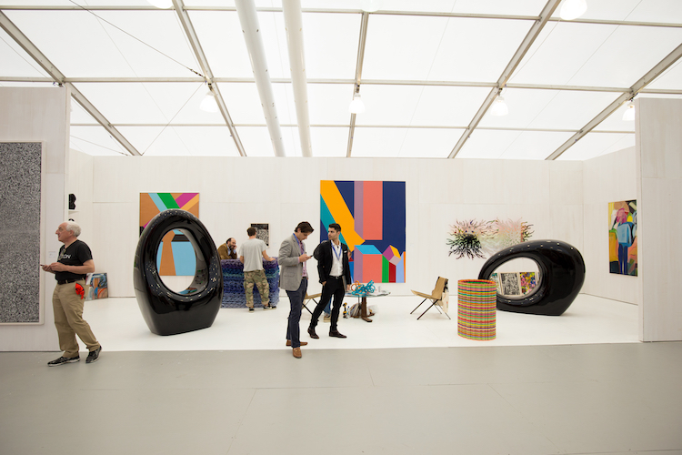
According to wynwoodmiami.com, after the art events, the influence and relevance of the arts community in Wynwood has become undeniable. Artists from around the world have sought inspiration in the area’s windowless facades and used them as canvases to showcase their work, leading to the vivid murals that adorn the district. So far in Wynwood, there is 400+ businesses, 50 city blocks, 200+ street murals, and 30+ eateries.

Wynwood's Restaurants

For restaurants, I want to add a variety of restaurants based on their food offers rather than picking on just the top reviews, since top reviews are able to overlap other restaurants with the same food and cause those who want those said food to have a conflict between where should they go and which is the better option. Here is a list of restaurants I feel I should mention:

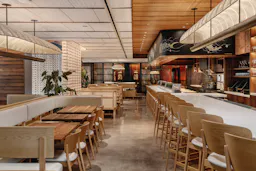
Uchi Miami in Wynwood (Japanese Sushi)

The restaurant have a variety of Japanese food and their desert menu is very delicious. The restaurant have indoor and outdoor tables and serves food in a portion where you are neither full or empty. This is perfect for visitors since they are able to eat what they want but also allows them a lesser chance having to carry out their food in a carton, and visitors will love to travel around the district with little items needed to be carry around as possible.

El Bajareque (Puerto Rican restaurant)

The price in this restaurant is cheap and affordable, but his food is known to be extremely good. It's a small restaurant away from various noises such as honking cars and sirens which makes it easier to socialize or if you want peace and quiet. The restaurant have many classical Puerto Rican food such as mofongo, chicharrones de pollo, and alcapurrias. 


The Salty Donut (Bakery)

This family run restaurant have some of the best donuts in Wynwood. The size of the donuts can potentially come off as big, but many find carrying around their leftovers around the city is worth, simply because it's delicious! They have a variety of flavor such as the classical strawberry frosted, glazed, and regular and some insane and unique ones such as guava and cheese and chocolate tres leche! The best thing for tourists, these donuts are cheap!!


BND Burger (Burgers)

This restaurant have a variety of alcohol and have juicy burgers. It appears small, but inside it is filled with tables, booths, and some street inspired art and pictures on the walls. It feel as though you don't escape the Wynwood colorful vibes! The food is also cheap and is a great option to eat for those visiting!

Art Pieces

For art pieces, I decided to select walls that I often see use as a background for social media pictures. I choose to pick my walls like this, because majority of people love sharing their travel pictures online plus they want to keep memories of their trip and to do that is to take pictures.

Maya Hayuk’s Mural


This wall is the one I mostly see on social media and it's quite popular among teenage girls, which teenagers are my target audience. I was also planning to use this background for my main cover as an attention grabber for teenagers and teenagers can imagine themselves near that wall and taking a picture with it and make it their next travel plan.


Sheryo

Weird monster Wynwood wall by Sheryo

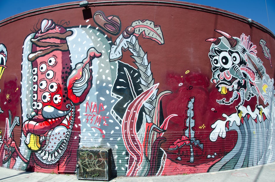
I picked this wall to capture the male audiences. When teenage boys goes to Wynwood either by force or by choice, they tend to look at art pieces that have a red tone or black and white tone and characters with crazy features such as sharp teeth, having more than two eyes, and sharp ears and horns. 


OG Slick

OG Slick's mural on the Museum of Graffiti's west wall.

I picked this wall, because for tourists many tend to come to Florida just for either Disney, Universal, and the beaches. This mural combines both a beach city's district name and Disney by using Mickey Mouse's hands to spell out Wynwood. For these tourists, this is a perfect way to take a picture saying they have been in Florida and will be able to post it and share it.

Websites:

https://www.miaminewtimes.com/arts/ten-notable-new-murals-in-wynwood-after-art-basel-miami-beach-2019-11327853

https://99designs.com/blog/creative-inspiration/wynwood-walls-miami/

https://www.theinfatuation.com/miami/guides/wynwood-restaurants

https://wynwoodmiami.com/learn/our-story/


Sunday, February 7, 2021

Color Research

For my set location to cover in a magazine, I decided to cover Wynwood Walls in Miami, Florida. Since my target audience consist of teenagers and they decided that Florida should be a combination of both cool and warm colors, I felt this area will be perfect. Although a concern arises, there are many many different arts in the district. Some are vibrant and Instagram-worhty for their complexity, beauty, and combination of colors while others are grayscaled and is used as a political message and others that uses both for style purposes. Plus, the art pieces in the area changes over time due to it being old and another piece have to replace it.


Since majority is more colorful and overrules gray-scale, I ultimately decided to use a vibrant color palette. Plus, I have to consider there may be some tourists outside of the US that will visit and come to the location, they might not understand the message nor ignore it, since they are more focused on the eye catching pieces rather than dull messages. 

I then used coolors.co to generate the third picture above into a palette and got this as a result.


Thursday, February 4, 2021

Masthead

The Traveler's magazine uses a bold text in their masthead. In the area they're describing, they usually have it with the masthead and the location is used in a semi-cursive format. Traveler catches the eyes of the people by being in bold and big text, and if they pick up the magazine, they can look above it to see the location and the audiences can decide whether to continue reading or not. The color is a darker blue to contrast from the sky blue background.


Wanderlust's magazine uses a bold cursive font to catch the readers attention and make the message of the masthead more playful instead of being powerful. The magazine chose white for their masthead to contrast the darkish background they have.


For Sunshine, I felt as though combining both Traveler's idea of describing the place with a cursive font plus Wanderlust's decision of using a bold cursive text for theirs will be perfect for Sunshine's masthead. I also ultimately decided to use a white color for the font because if I decide to a picture of a clear sky, it'll perfectly contrasts the color of the sky, but if there is a color that blends in with the white of my masthead, I'll either choose black or another part of the cover image, that could contrasts the color area of the masthead.

The font I decided using is Rouweth and it can be found in this link below 

https://www.dafont.com/rouweth.font?text=Sunshine&psize=l&back=new


Tuesday, February 2, 2021

Travel Magazine Questionnaire


What magazine title do you prefer?

I agree with my audience's top choice since the title, Sunshine, can relate to Florida because Florida is nicknamed the sunshine state. 

What subject do you believe should be the cover image?

I'll be picking beach sunset or sunrise instead, although Universal / Disney is ideal, it is currently packed especially with covid going around, plus a single day to a park is $100+ and weather become quite unpredictable and mess up the photo. I feel as though a beach will be a safer option since most families are already distant from each other and this is where the sky is clearly visible to capture the beauty of Florida beaches, and if weather doesn't cooperate, I can come back anytime.

What feature in the magazine you prefer to see?

I agree with my audience on the map, since this feature can be interchangeable such as doing a map of the whole state, or a region of the area like South Florida. At the end of the day, the most ideal thing for visitors is traveling to as much places as possible.

Which city do you think a photoshoot should be taken?

I also agree with my audience since majority of the time, many visitors are aware of Miami for their beaches, but they don't know the true beauty of it, which can appeal to readers to take a closer look. They also aren't that knowledgeable when regarding areas such as Saint Augustine for being the first city or knowing Tallahassee is the capital. 

Which color scheme you feel best fits Florida?

I feel as though a mix of both will be ideal. I was planning to have my color scheme the same as a Florida sunset / sunrise and most common colors with these skies are purples, pinks, oranges, and yellows. I feel having one set of colors that are considered warm a bit strict, but having a mix is more playful and more vibrant as Florida is meant to be playful and vibrant tourist sites.

Regarding to travel, which is more important to you?

I agree with the popular vote, but I feel combining other answers such as food and culture and weather to the popular one, tourist attractions, will not only have more content, but talk more about the area in its totality rather than being strict on just tourist attractions. 

What time do you believe the main cover should be taken?

I agree with the sunset / sunrise being the top answer. I also think adding sunny with some clouds with the sunset / sunrise will truly capture everything about Florida's weather just by looking at the sky.

Which age group you fall under?

Since my age group mostly consisted of 14-18 year olds, I feel I should appeal to these audiences by including a feature story plus some attractions in the Miami area that teenagers enjoy to go to (Wynwood Walls).

FINAL PROJECT